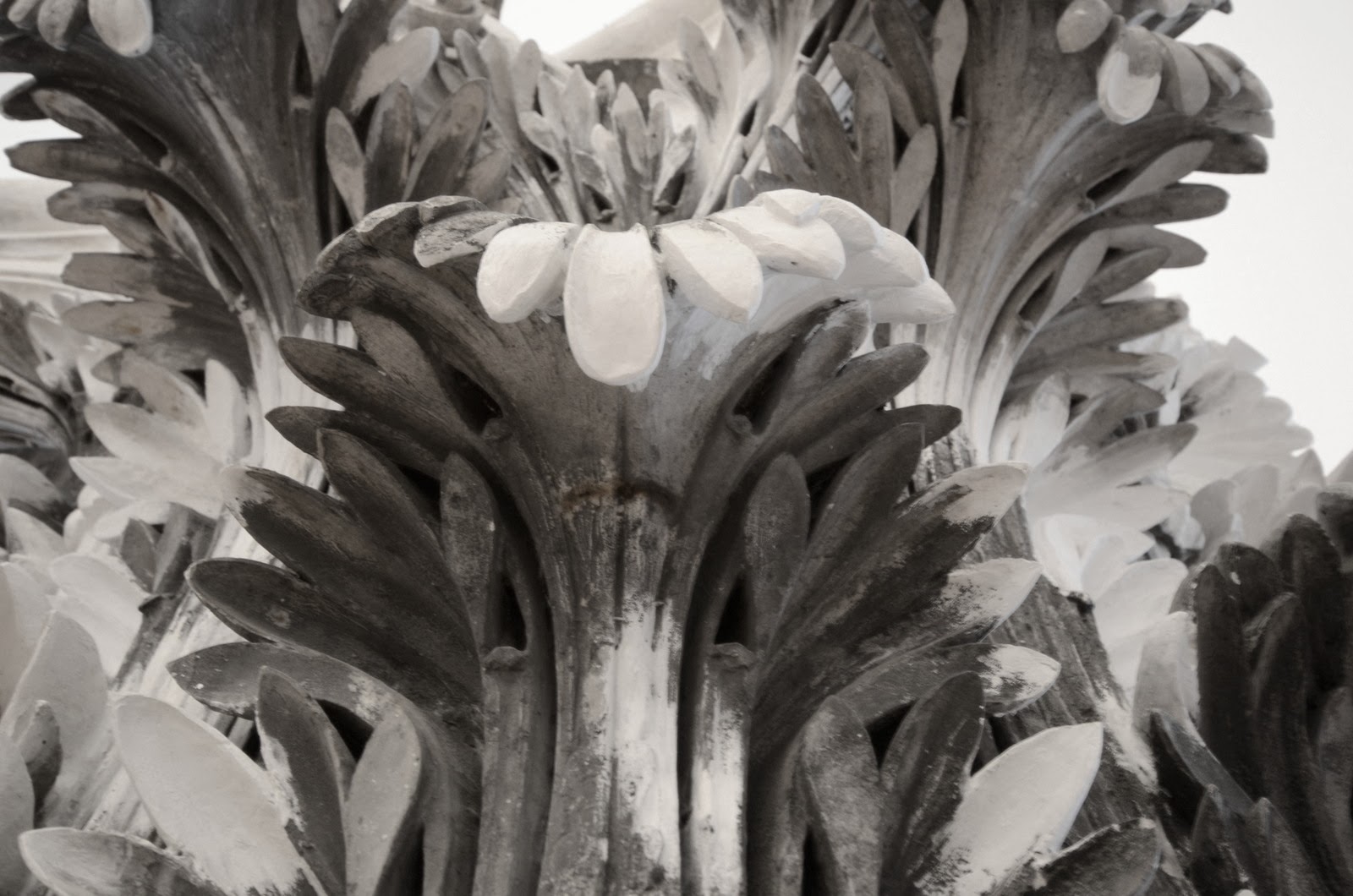
Here are some of the architectural details I was speaking about in yesterday's post. These column toppers once graced some part of the church, but were removed after damage during WWII. Details like these always look good in black and white to me, hope you agree!

I think the details are very appropriate in black & white. Besides, it helps show all the nooks and crannies.
ReplyDeleteSuperb, Hal! Superb!
ReplyDeleteBlack and white lends them a timeless feel. Good capture on this shot.
ReplyDeleteI do agree...and thank you for sharing this!
ReplyDeleteOui c'est vrai. Et dire que tout ça avait été rasé avec le reste de la ville...
ReplyDeleteLots of detail to admire too!
ReplyDeleteAmazing detail and yes, they do look good in black and white.
ReplyDeleteLiz
Still beautiful!
ReplyDeleteI can't even begin to image how this has been created. Beautiful!
ReplyDeleteI do Halcyon.. the B&W enhances al the light and shadows.
ReplyDeletep.s. hope the weather is a bit cooler for your husband when he is here :)
The B&W enhances the details nicely!
ReplyDeleteYup. They look good this way. On behalf of the color police, I will waive giving you a ticket.
ReplyDelete